


When I first made the switch and started focusing my design studio to cater only towards wellness and conscious lifestyle brands, I was afraid that I was narrowing too much and would fail. Enter my new clients: Sam and David! They blew me away when they told me they were starting their own creative agency with mindfulness at the root of all their services. I had known Sam from my days back in the Advertising world and I thought that the Universe was being so clever by putting us in each other’s paths after all those years.
I was so happy that they trusted me enough with their vision. It was not only a joy to work with them, but also as a sort of weird validation that I was going down the right path as well. It was one of those meant-to-be moments.
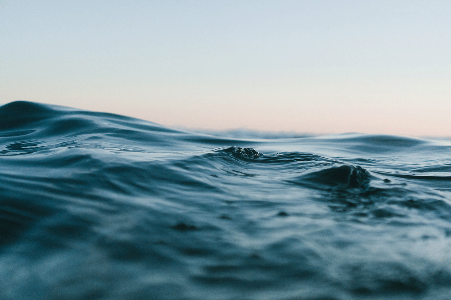
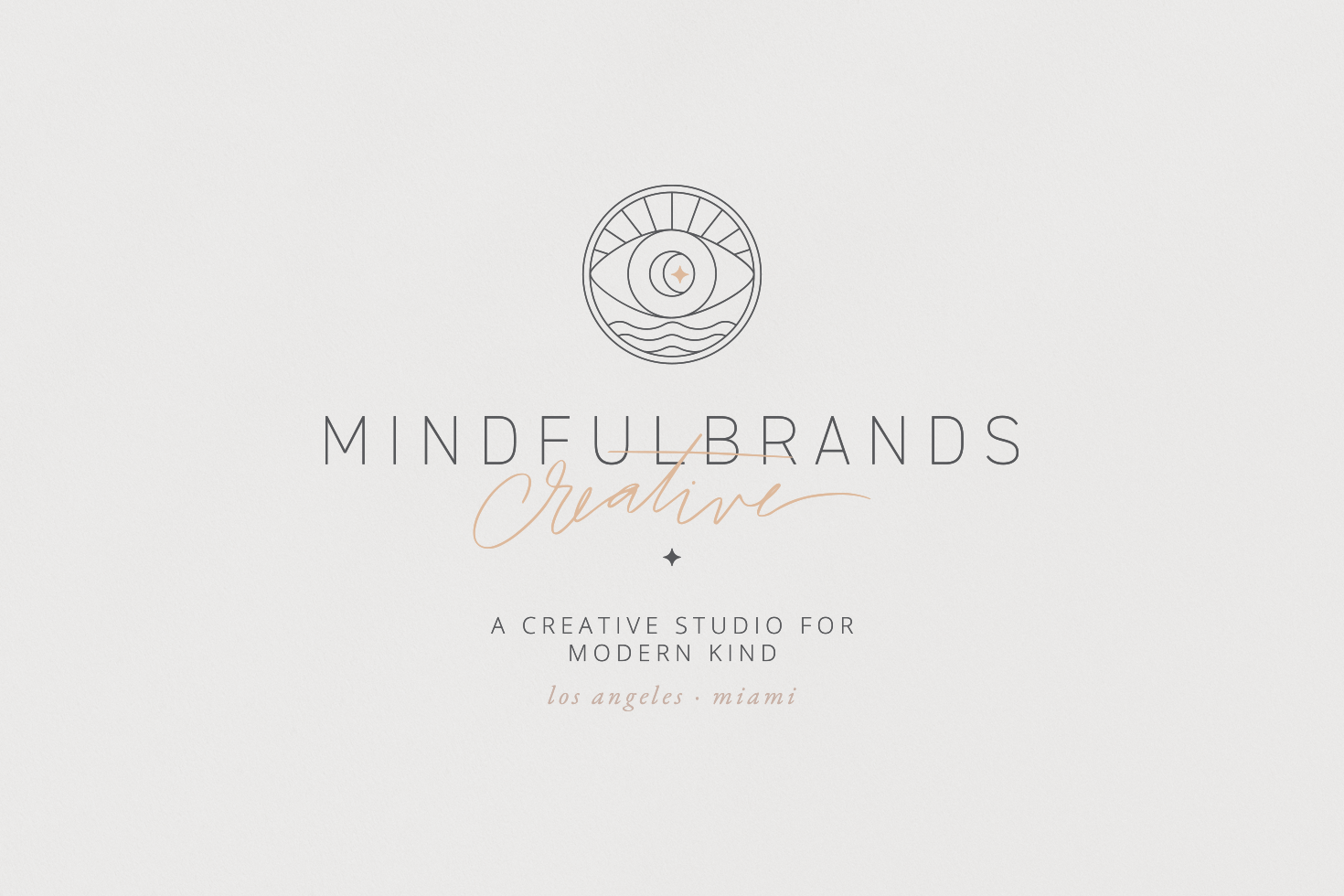
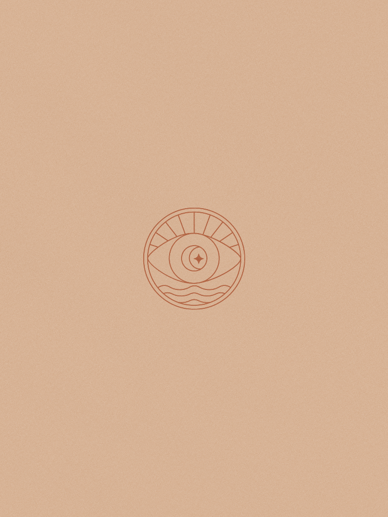
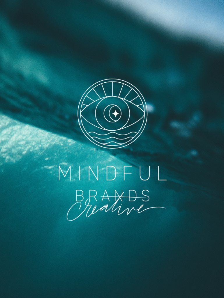
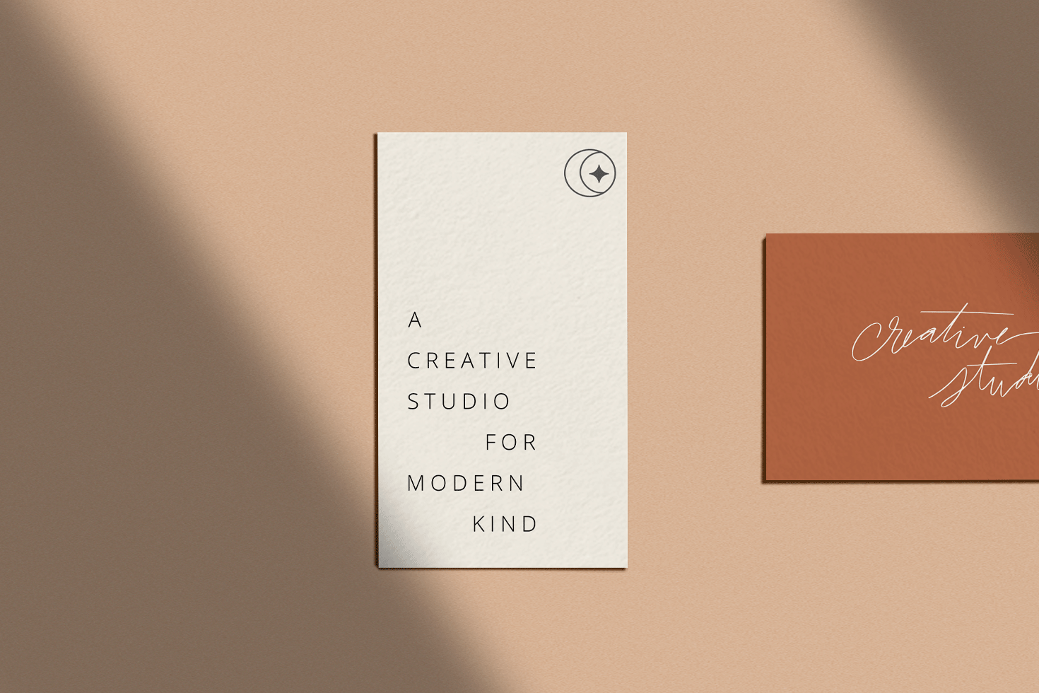
In order to position them as the go-to wellness creative agency I wanted to explore iconography with thin organic lines in the form of natural elements (foliage or a geometric moon/line icon). After trying out different combinations of shapes and illustrations I settled on making the third eye the centerpiece of the icon. I loved the strong mindfulness graphic so much but I wanted it to be grounded by some earth elements which ended up being the sun and the ocean. The end result is a perfectly balanced icon that represents Mindful Brands, their values, their story and what sets them apart from other creative agencies.
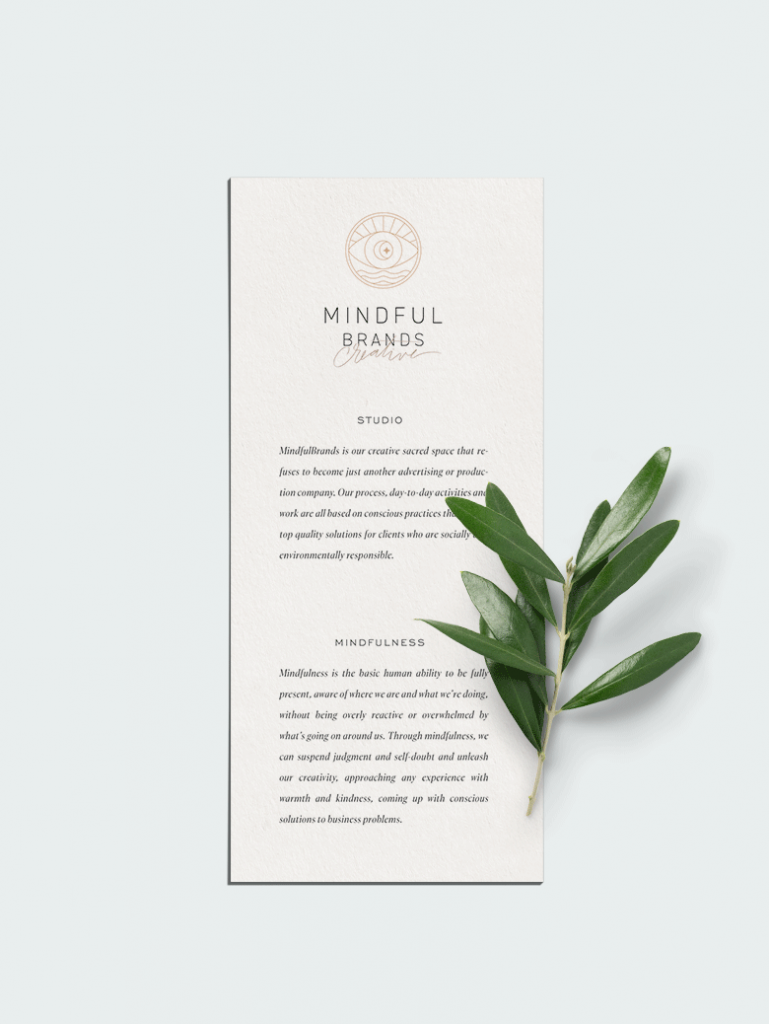
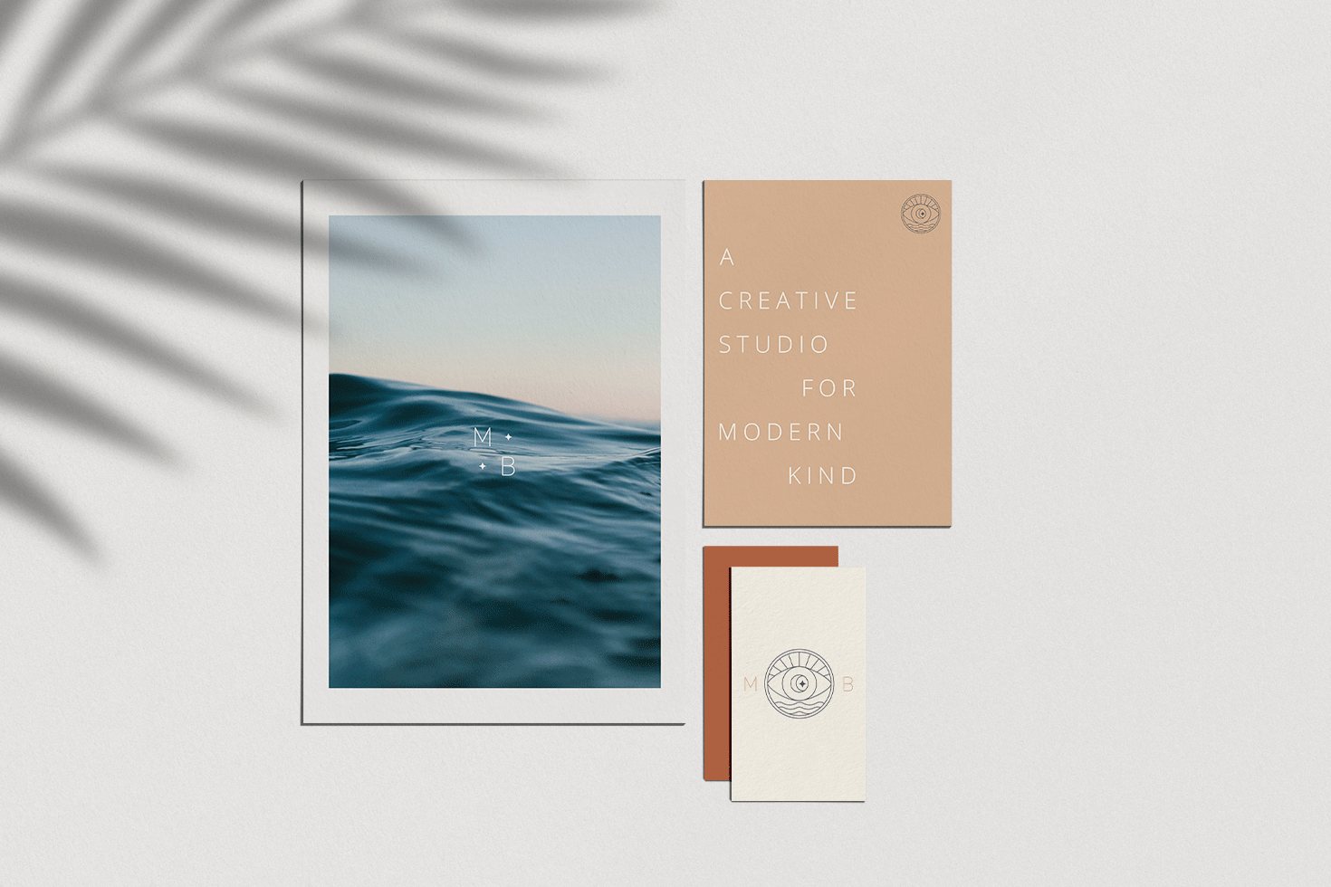
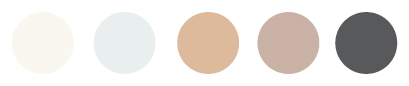
To ensure that the aesthetic of the Mindful Brands Creative remained timeless, I curated a warm color palette with tan hues and soft accents. The colors are crisp, modern and friendly. I wanted to stay away from greens as it is very overplayed in the wellness industry and pulling inspiration from from the earth’s heart aligned more with the values of the brand.
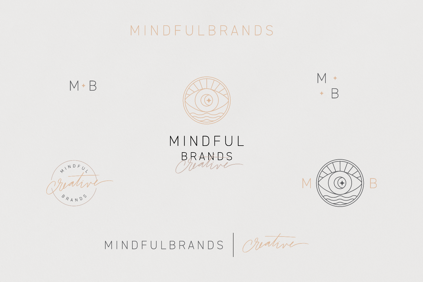
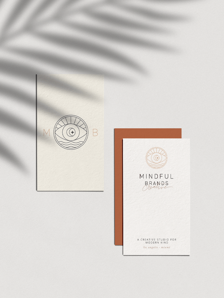
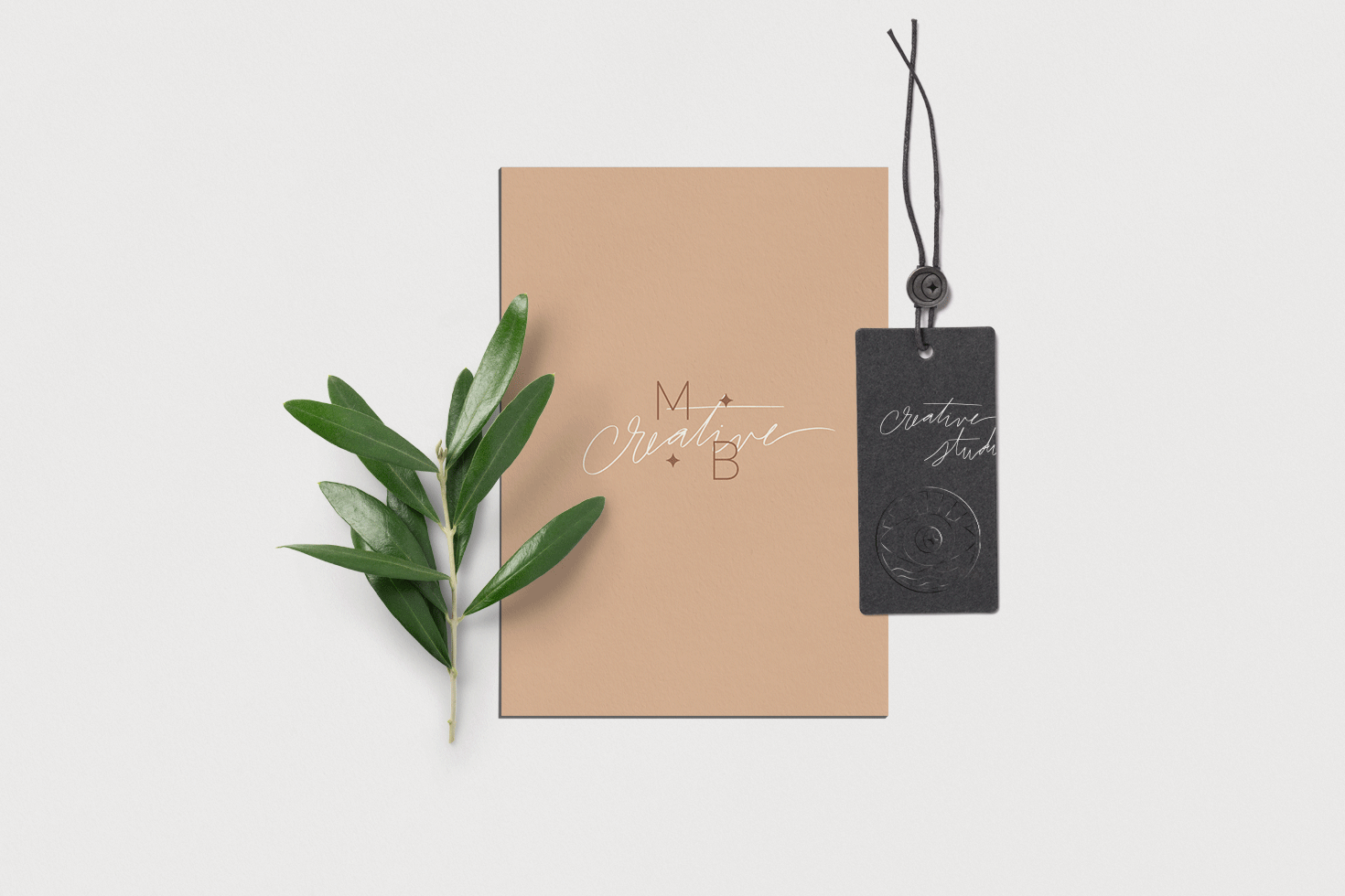
This is definitely one of my favorite projects to date because it is so close to my own brand values! Plus this icon is in my top 5 fav designs I have ever created because it holds so much conceptual meaning. The icon is the merging of the Self with the Earth. With thin lines that represent the sunlight and the ocean (because both Sam and David travel between coasts!) and carefully balanced with the mind’s eye, the icon is able to represent mindfulness without having to rely on the overused “green” icons — which in my opinion is very unique! So what do you think about this brand design?
—
Have a brand in mind and wanna work together to bring to life? Contact me and let’s make some magic!


