


The world is a carousel of color! So it’s important to create a color palette that feels like you. If there’s something I love more than type… it’s color. Color carries across your vision, message and VIBE. It’s truly magical. It can make or break your branding. It communicates what you want your audience to see and feel. Color is eeeeeeeverything.
Designers use color to tap into their target audience’s emotion. I use it to create an experience and encourage action — like let’s say someone clicking on a button or image. In fact, color is so important that there’s tons of research done based on color hues and 60% of people base whether or not they connected with a message solely based on… you guessed it, color!
How to Create a Color Palette True to Your Brand
A color palette usually consists of 4-6 colors, you don’t need to go crazy but you do need a good variety of balanced colors from accents to neutrals (more on that later). There are also a couple of things to consider when creating a color palette so I’m going to guide you through a series of questions that will help you figure out a color palette direction! Ready?
1. What are 4 adjectives or buzzwords that describe your brand?
Is your brand classic or modern? Calm or Animated? Feminine? Raw or Refined? Simple or Ornate? Is it playful? Serious? List out what you think your brand is.
2. If your brand where a Season which one would it be?
Are you warm like Fall? Playful and vibrant like Summer? Cool and Minimal like Winter? Or maybe you see yourself as fresh and feminine like Spring?
3. What do you want your audience to feel when experiencing your brand?
Do you want them to feel happy? What kind of emotion do you want to evoke?
Color Theory
With those answers in mind, it’s time to learn a little bit about color psychology. Colors have baggage my friend. It comes carrying this weight of associations and feelings that they evoke in us humans. In order to carefully pick our winning brand colors, we need to know what their baggage is and what story they can tell for us. So here’s a nifty chart! Try to see what colors hit the adjectives and answers you have.
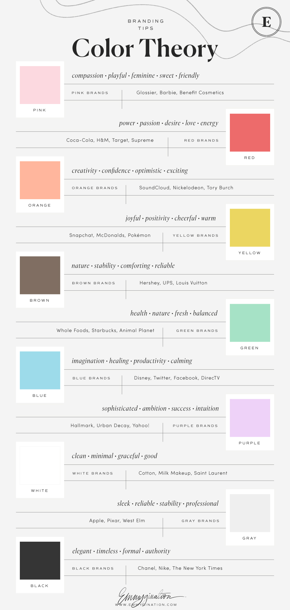
When you look at the chart you probably already gravitate towards specific colors. My power color, or most confident color has always been pink + yellow and that’s what I want my brand to represent. So even if pink isn’t “confident”, it is to me. At the end of the day, you have to trust your gut! Create a color palette that aligns with your brand values and essence and that feels right.
The Anatomy of a Brand Color Palette
So once you know what sort of colors you want in your palette or what makes sense for your brand, you need to hit a couple of things so that it’s balanced. There is this small formula that will help you create a color palette to perfection and it’s the one I use for all my clients.
1-2 main colors + 2-3 neutral colors + 1-2 accent colors
MAIN COLORS: If one color could tell your brand story, this would be IT! This is your go-to for almost everything and will take up the most space in your brand. For example, this color is a light pink for me and it’s the most dominant color on my site.
NEUTRALS: These will add balance to everything. They are sort of grounding colors. These often include the blacks and grays mainly used for type and backgrounds.
ACCENTS: Playful colors that pack a punch! They add dimension and depth to your brand and have the sole purpose of complementing your main colors. These are used very sparingly around your brand assets. Uses include: site buttons, a subtle icon, a call out header, a shape.
You can see the formula on my own color palette below:
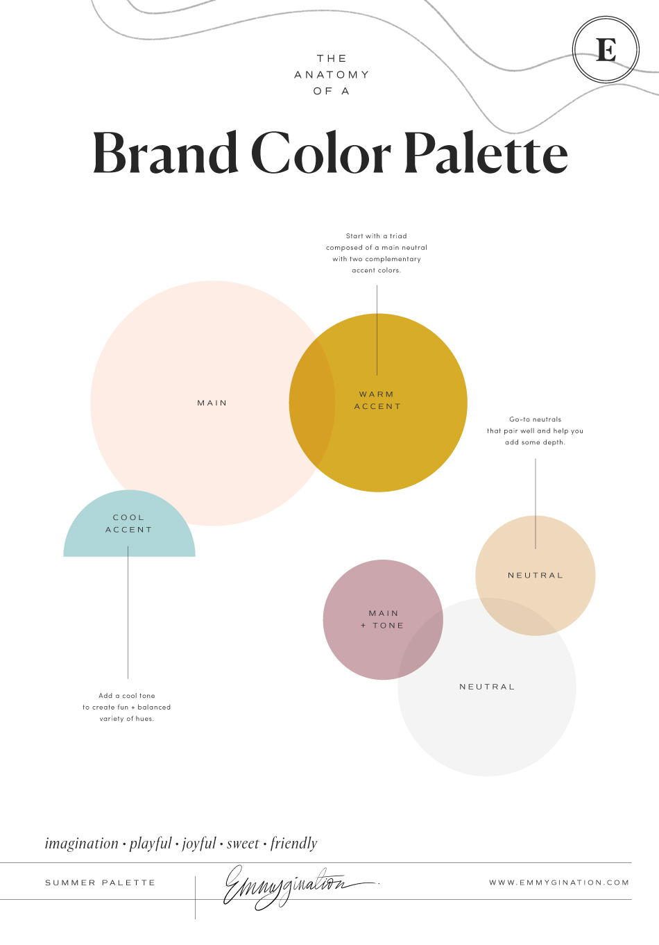
My brand adjectives are playful, imaginative, joyful and most importantly friendly. If you look back at the color theory chart you can see that I created my color palette based on my adjectives. I do like to break outside the norm so I added a cool color (the blue) as an accent to complement my very warm toned palette. You have to go with your instincts and really feel what is true to your brand. There really is no right answer. The only rule I would stick to is to keep it balanced.
Tones, Shades and Tints
One last thing about color… understanding how to play around with one hue. Meaning how to make one color, let’s say pink, brighter or more muted. If you’re a designer, you’ve probably heard the phrase “can you tone down the color”. Meaning that it may be too intense. Or maybe you find a color you like but would love for it to be a shade lighter or darker. When you wanna get a color juuuuust right, that’s where tones, shades and tints come into play when you create a brand color palette.
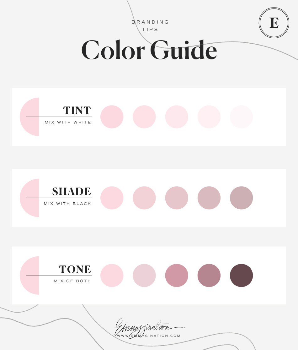
TINTS: When you mix in a pure color hue with white. Adding more white makes it lighter and therefore may change the meaning. For example a dark blue represents loyalty and trust but a light blue will change to mean tranquility and peace.
SHADE: Mixing black in with a pure color. When adding in black all colors tend to be more dark and communicate more of a mysterious or serious vibe.
TONE: The fine balance of adding both white and black to a pure color. Adding different amounts of both white and black will always “tone down” the vibrancy and intensity of a color.
You can always play around with one color you like but aren’t convinced with yet by messing with the tone of it. So if your brand is playful and has a big personality you wouldn’t want to add any shade for example. But if you have a pink that you love but is a bit too playful for your brand, try adding in some white + black to make it more of a neutral.
—
Creating a brand color palette that feels like you all starts with knowing what your brand represents. It is also a crucial part of any well rounded branding system and it brings all your elements together, so make sure that you absolutely love and connect with it.
What types of colors do you love the most? Do they resonate with your brand? Let me know!


