Wedding Photography Branding
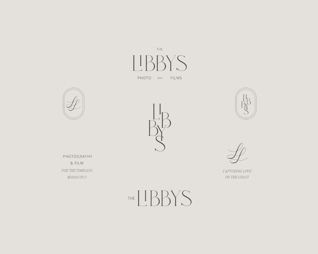
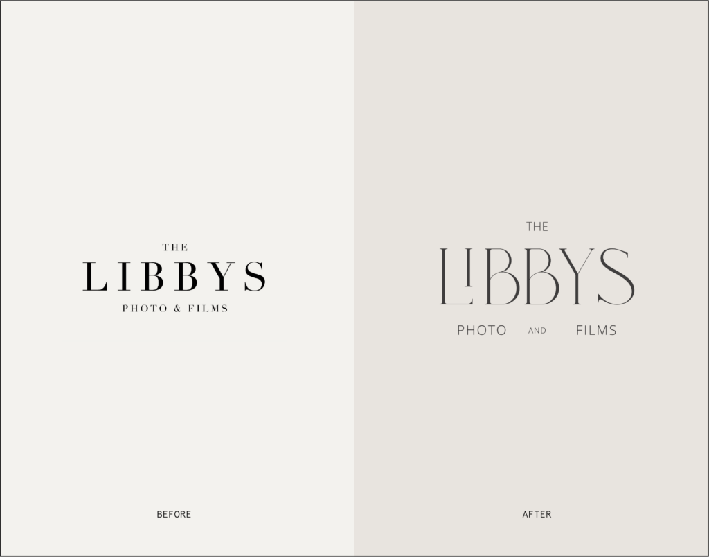
Working with The Libby’s to re-brand their business to fit more of a modern wedding photography branding and design was a breeze. Amanda and Cole are both amazing clients who knew what they wanted and had a vision for this next step in their business. They wanted to elevate their current logo design and have more of an upscale quiet luxury brand vibe.
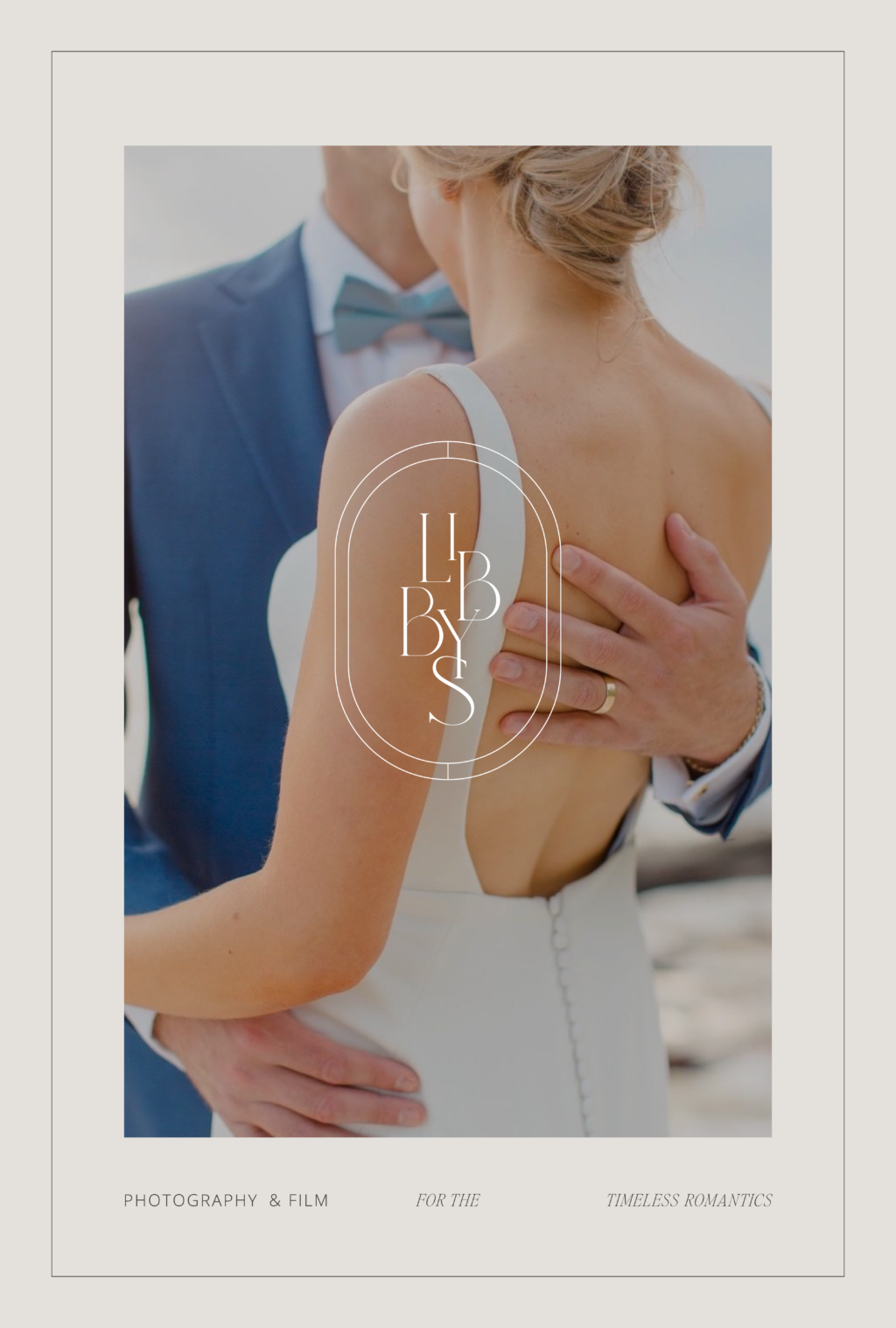
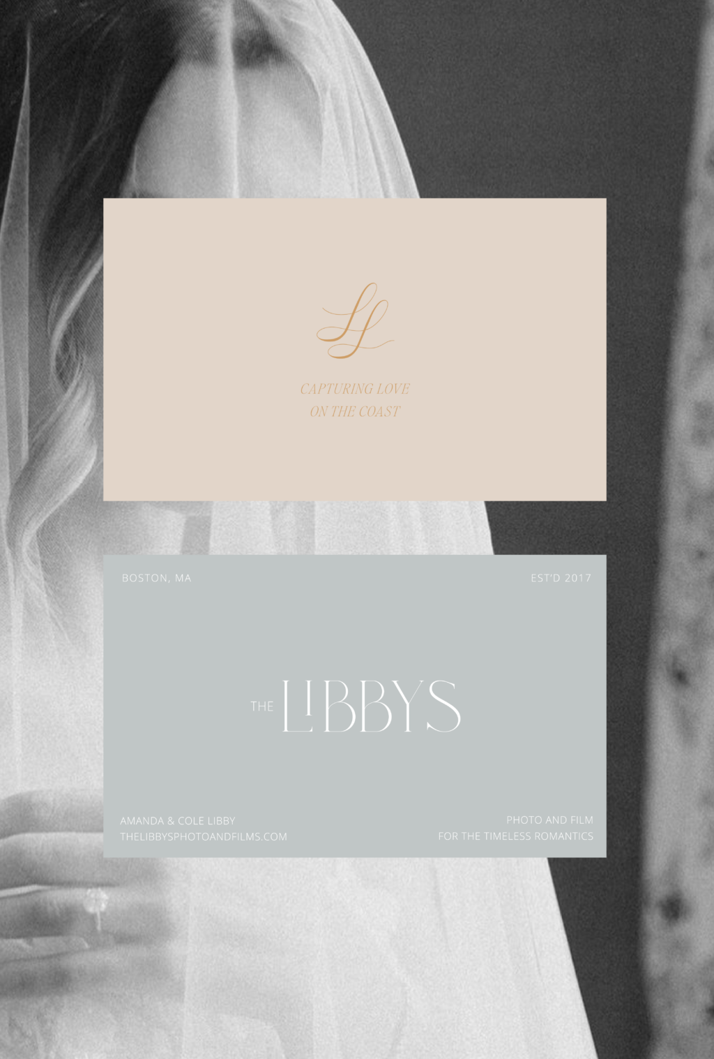
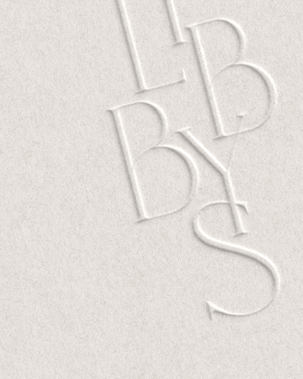
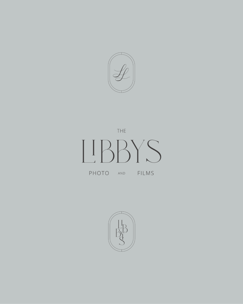
Wanting to keep some of the original elements of their logo for brand recognition, I decided to keep a similar structure to their logo type but elevate it with a modern serif font with custom elements.
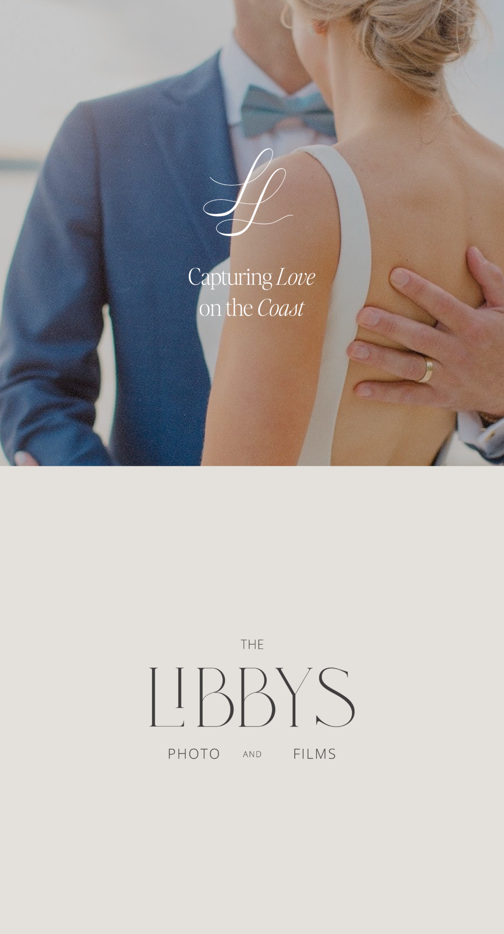
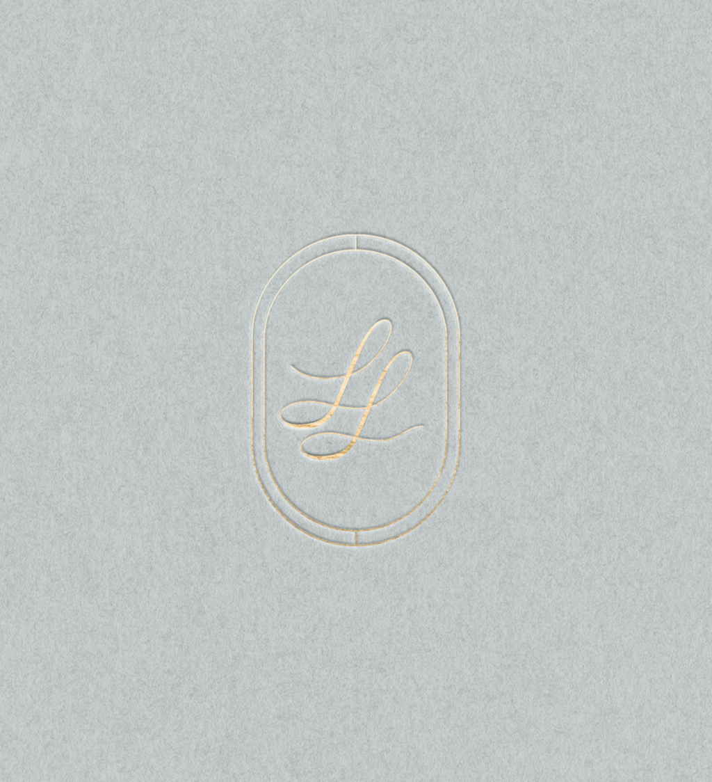
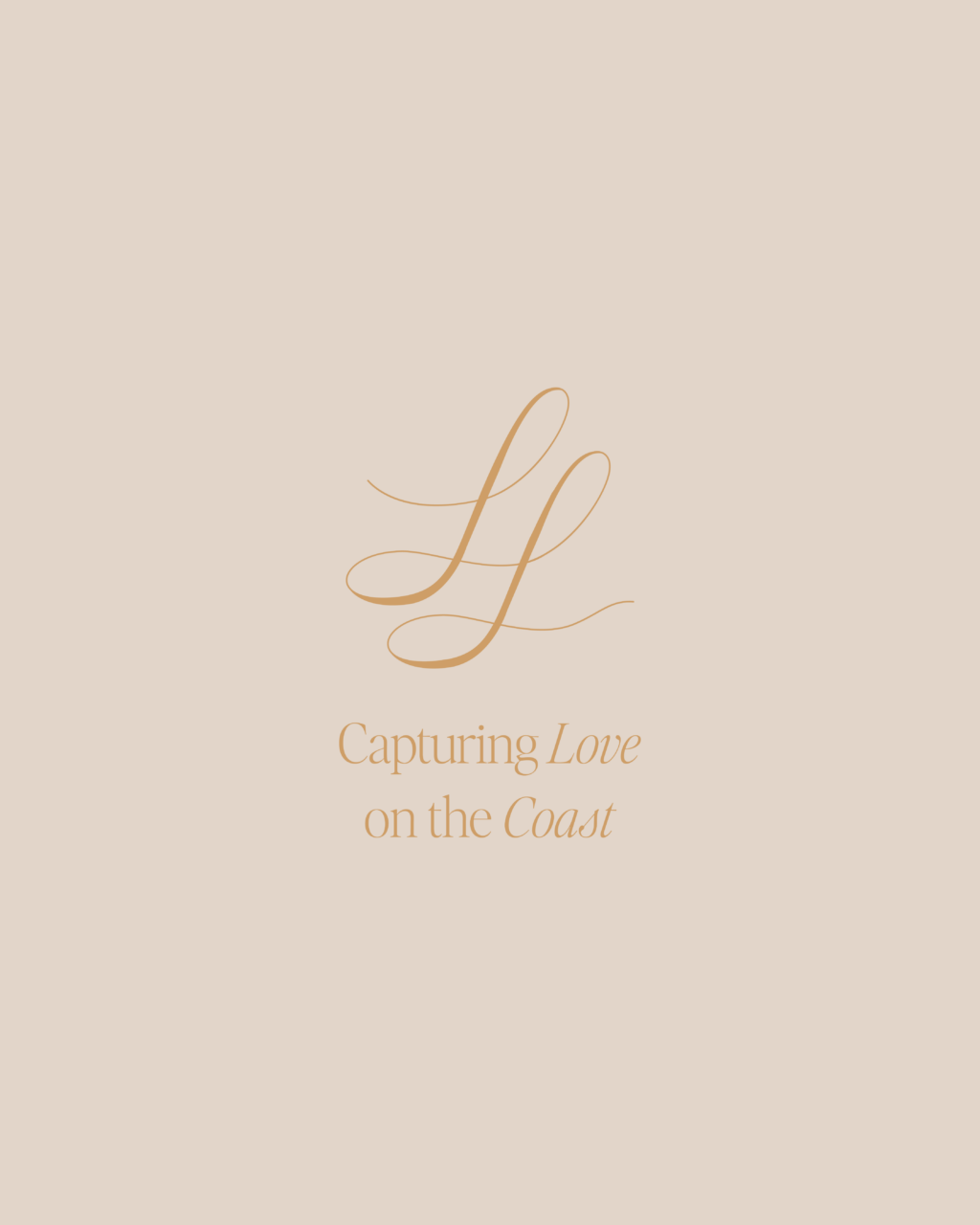
In developing their icon, we explored several iterations of a T + L monogram before opting for two intertwined L’s, symbolizing both Amanda and Cole Libby. The elegant script “L’s” evoke ribbons, aligning well with the wedding theme, while also resembling a double infinity loop, a fitting symbol for weddings. The monogram signifies the unique strength of each Libby to their wedding photography business: photography and videography, as well as their partnership.
The monogram has an air of feminine while fitting into the wedding photography space to further attract their ideal couples. It is quiet luxury branding.

If you’re in need of a rebrand too, I’d love to chat! Check out my Services page or reach out out and inquire about your project.
