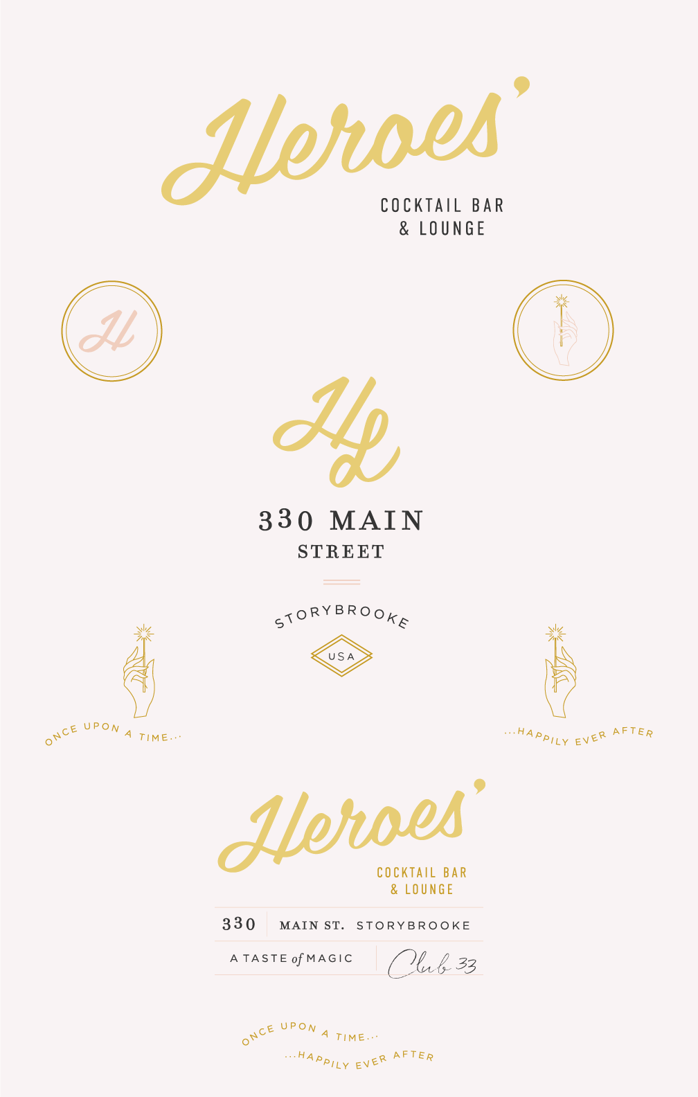
It’s no secret that I love Disney and all Disney themed things… so it’s only natural that after branding a Villains Lair where all the evil baddies can go grab a drink, I would move on to do a Disney Heroes Bar!
I honestly love to combine my two favorite things: Branding + Disney. If I could afford the time to just create branding for each and every Disney character, believe me, I totally would. But, as the responsible and lame-o adult that I am (and the crippling credit card debt looming over me 24/7), I can only sporadically do these sorts of things.
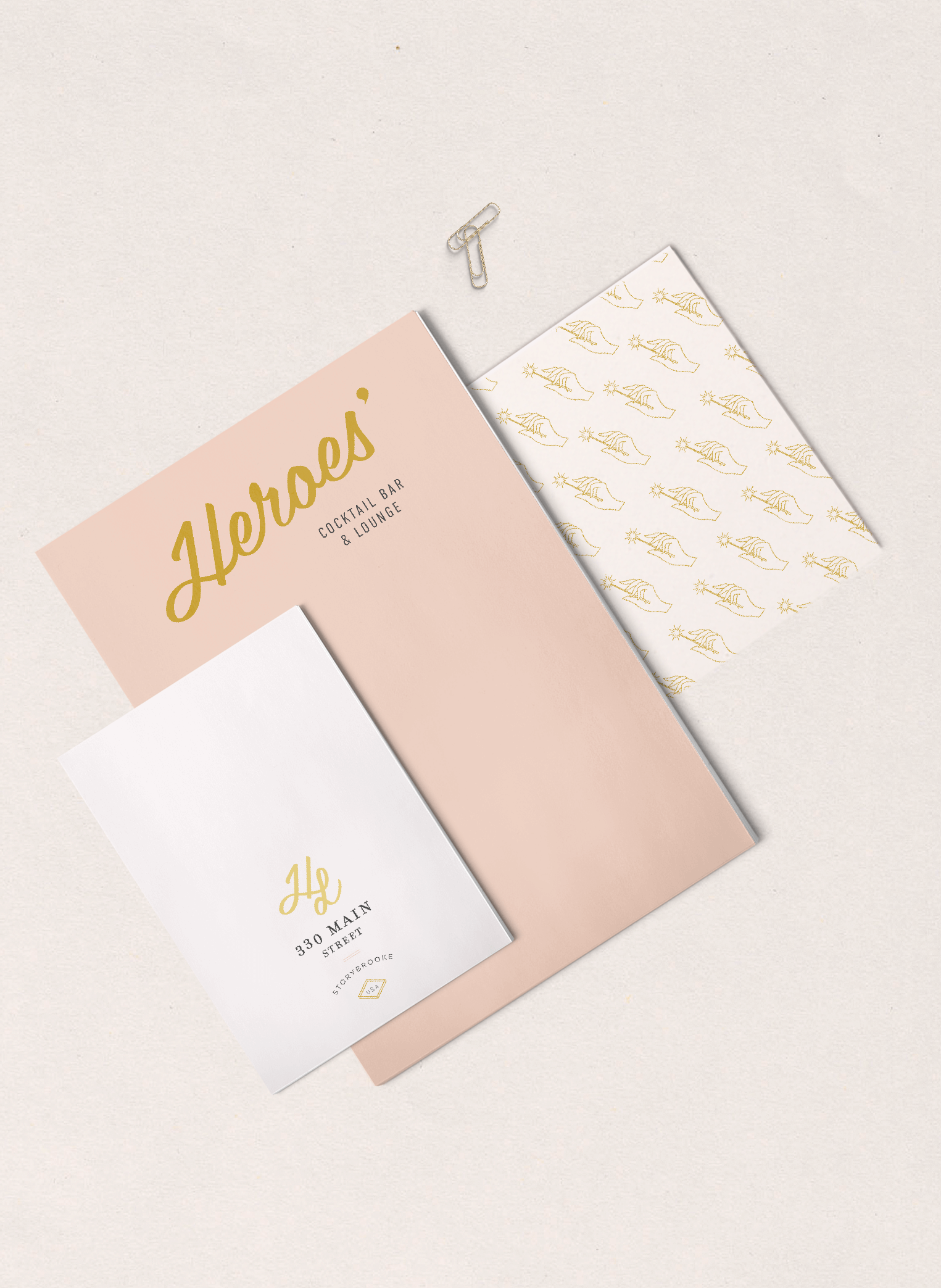
Either way, I am absolutely obsessed with how this came out. I wanted to go a totally different direction than the Villain’s branding which is more brooding and dark. So for our heroes, I wanted something more ethereal with a heavy goldeny look.
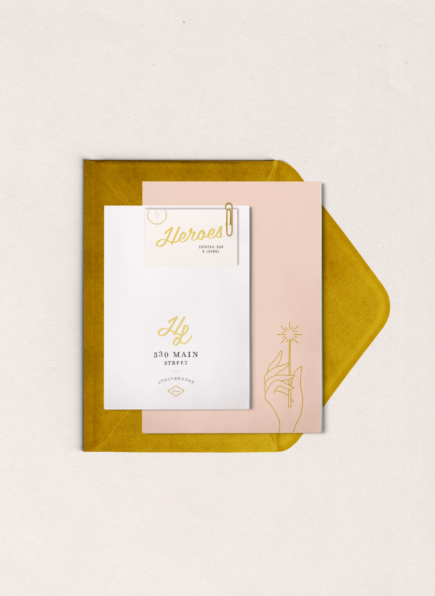
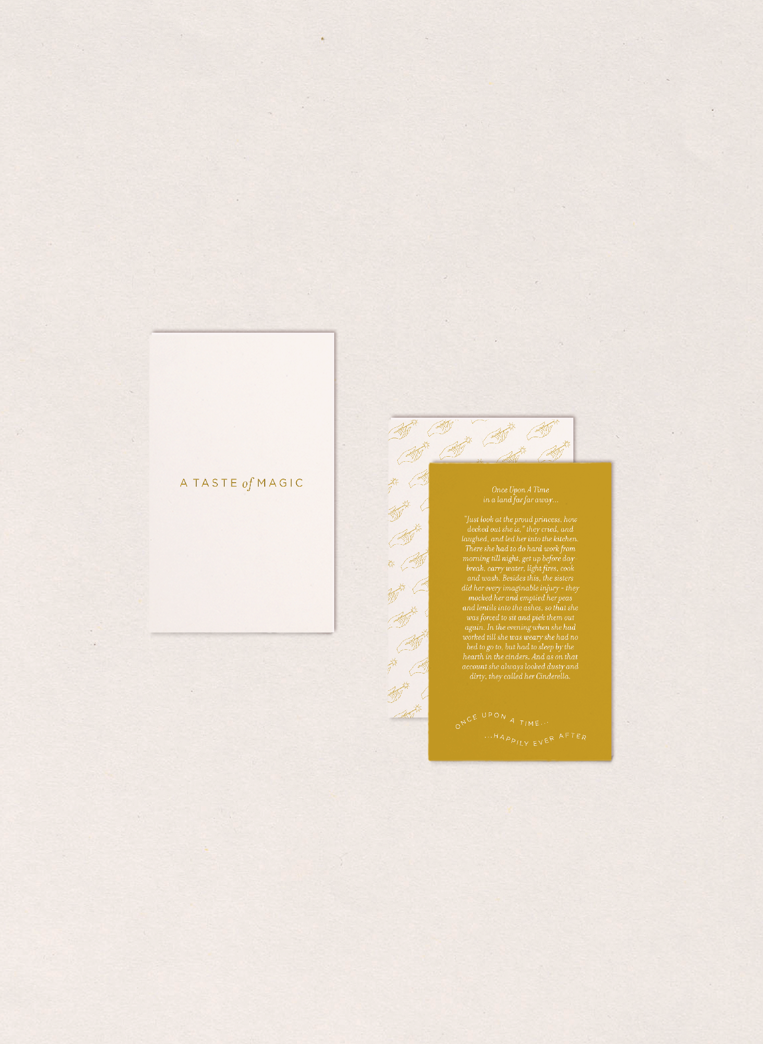
It had to scream pure goodness without looking too royal. This bar is meant to host all sorts of heroes not only princes and princesses. I wanted to design something where you could find Judy Hopps and Nick Wilde chatting it up with Ariel and Flounder. So it had to be neutral but cool, a tad hipster-like ????
I was very inspired by vintage Speakeasies to give a hidden, relaxed and boozy vibe where the Genie could be servin’ up cocktails, craft beers, and solid one-liners. Sounds like a dream to me!
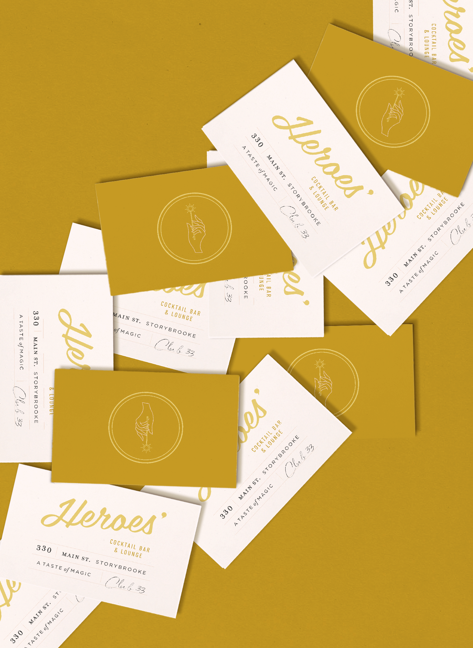
Since I am on the Disney cocktails train, I took this time to brainstorm my upcoming projects for that series. It was so fun to pair characters with boozy drinks like the Genie n’ Tonic, the Hakuna Mai-Tai-Ta and the very unfortunate but very funny Bloody Mary Poppins.
I mean who wouldn’t want to spend a Saturday at this bar?! If I knew how to 3D render spaces I would start interior decorating the shit out of this. I’m obsessed.
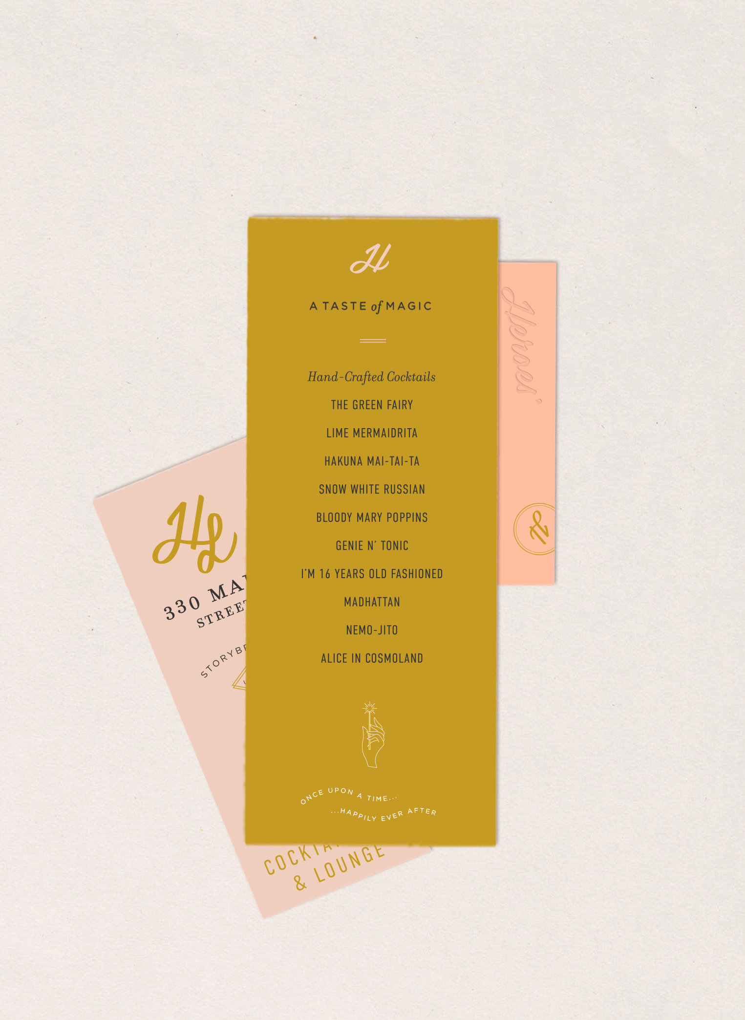
I love that the branding is not on the nose either… I really like my design aesthetic and didn’t want to be obviously Disney, so I’m not using any elements that scream Disney. I always aim to be inspired by it but not adopt it as my own. I actually hate the Disney font… Le Gasp!
My designs are always clean and minimal with a lot of type work and this branding is no exception. I love how I never know how a design project is going to take shape, I just kind of let it flow and always end up surprised by the end product. I mean come on, how cute is that hand holding the wand?! I’m giving myself kudos for that one.
Let me know what you think in the comments below, and as always… Do As Dreamers Do! Even if it’s designing things for yourself 😉
