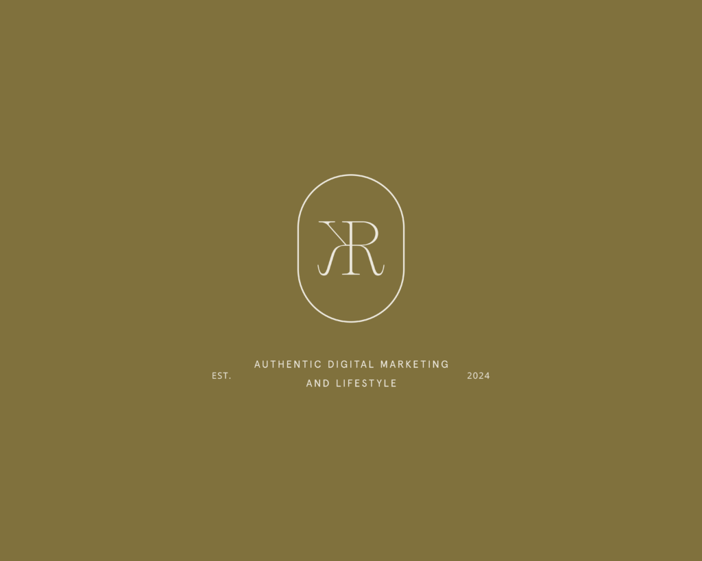
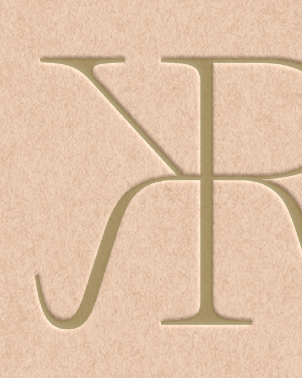
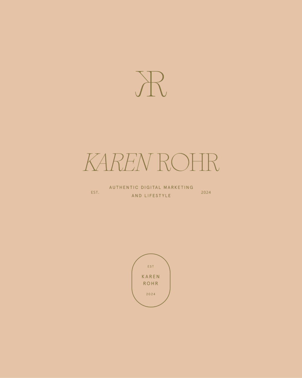
There is nothing I love more than creating monograms and this modern feminine branding design features just that. At it’s core, this minimal brand design has elegance and grace. It all culminates from the ethereal feel of the KR monogram. The letters themselves really lend themselves to create a mirror reflection and fit just like a puzzle piece. I truly love the mirrored curves in the serif type forms giving this brand a clean feel with a flourish.
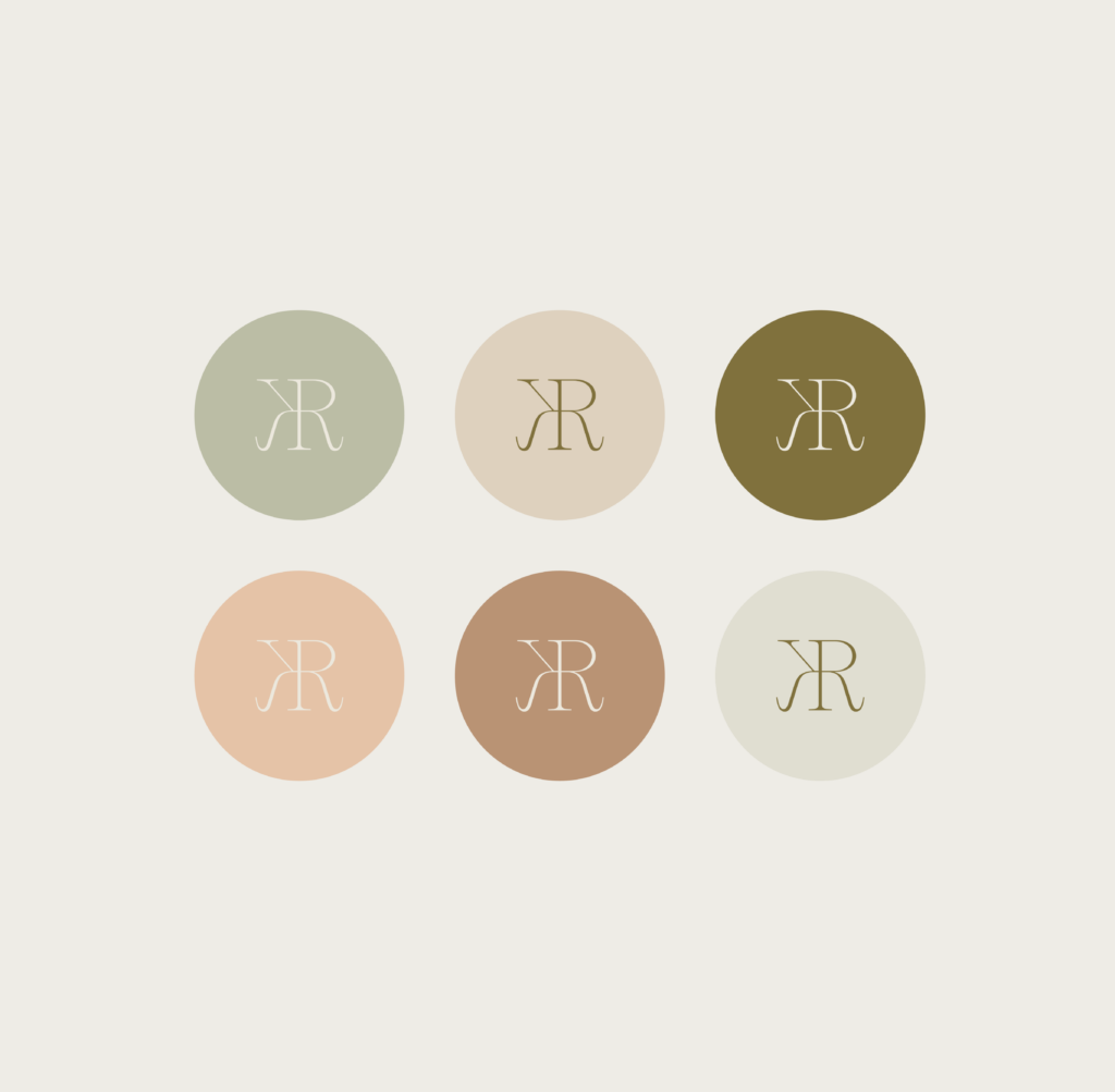
Karen Rohr is not only a dear friend but also a talented interior designer. Over the years, she’s honed her skills by creating captivating content for her personal accounts. Recently, she decided to transform this side hustle into a full-fledged online business, focusing on helping others with digital marketing. To achieve this, she needed a brand that would both reflect her vibrant personality and attract her ideal clientele. Karen had one specific request: a green-based color palette to be central to her branding. Beyond that, she trusted me completely to bring her vision to life, giving me the creative freedom to design a brand that would seamlessly blend her expertise in interior design with her new venture in digital marketing.
Given her background in interior design, I aimed to blend elements of both fields into her branding, allowing for future expansion of her services. The main logo features typography that’s both delicate and dynamic, creating a professional yet flexible brand identity that leaves plenty of room for growth.
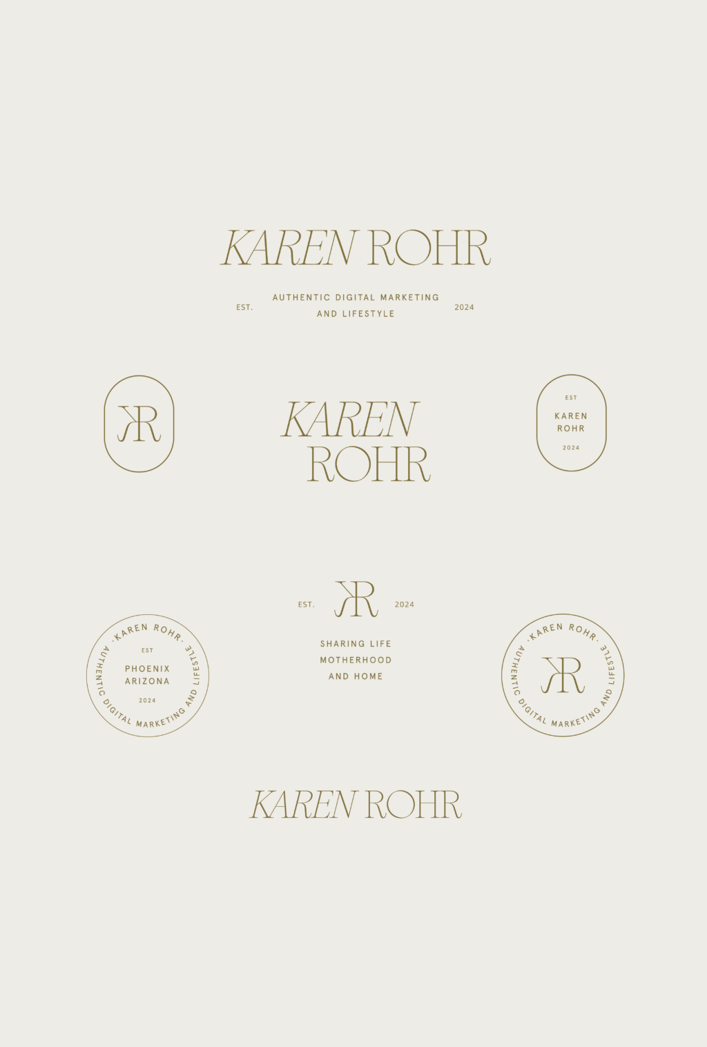
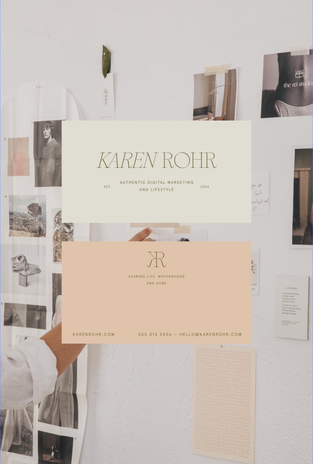
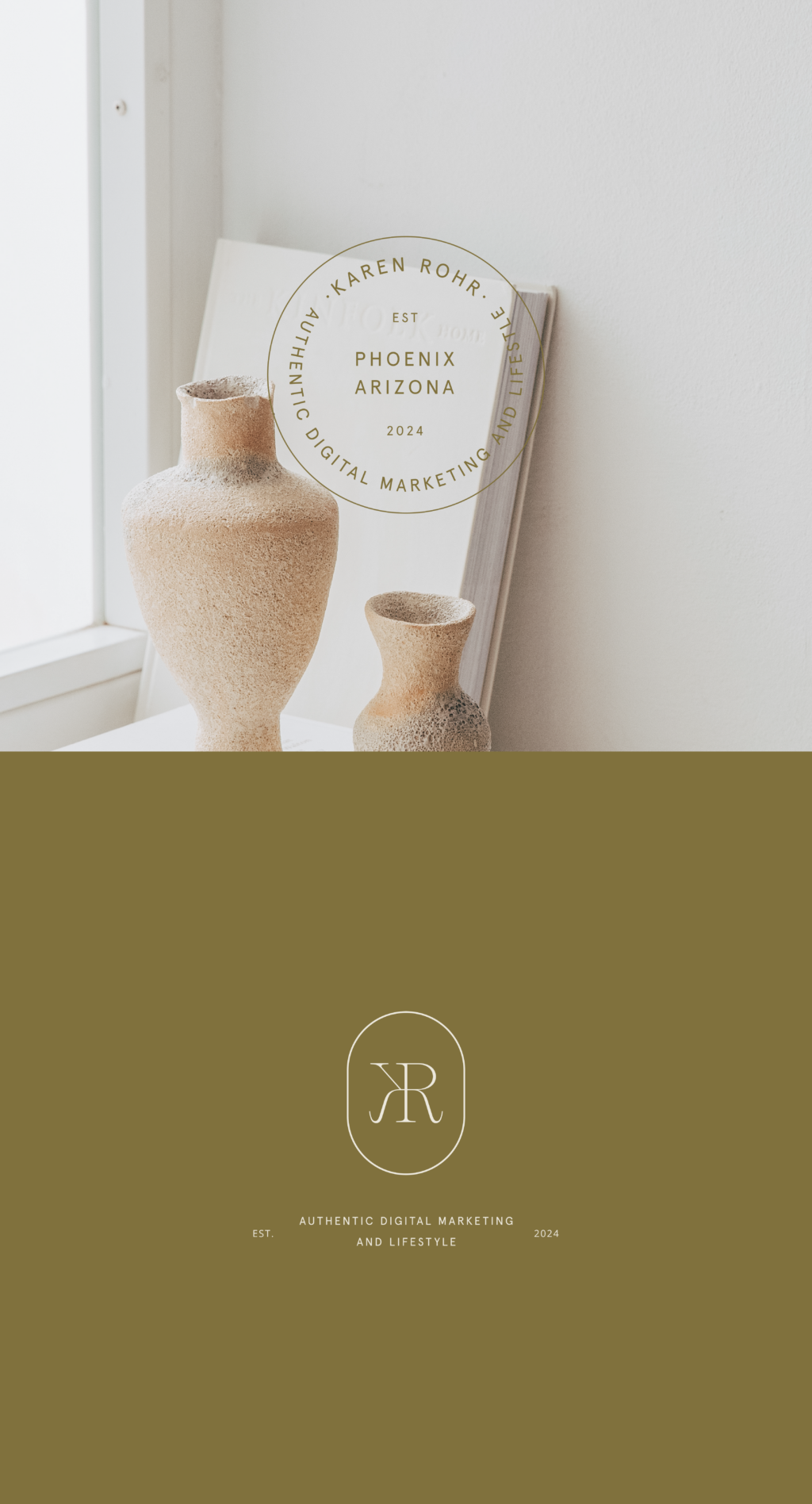
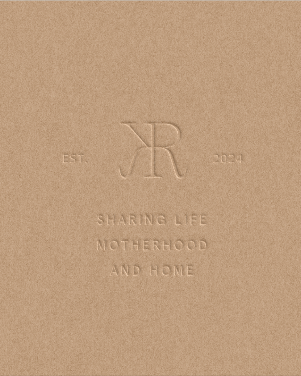
With Karen’s unique blend of interior design expertise and a new focus on digital marketing, the brand design needed to be as multifaceted as her talents. I developed a visual identity that seamlessly integrates sophisticated elements from her interior design background with modern touches suited for digital marketing. The color palette, centered around her beloved greens, evokes a sense of growth and creativity. The typography chosen for her logo is both elegant and fluid, reflecting her professional yet dynamic approach. Additional design elements, such as subtle textures and thoughtful layouts, ensure that her brand feels cohesive across all platforms, whether she’s showcasing a new interior project or launching a marketing campaign. The result is a brand that is both professional and adaptable, perfectly mirroring Karen’s journey and aspirations.
If you’re in need of a rebrand too, I’d love to chat! Check out my Services page or reach out out and inquire about your project.
