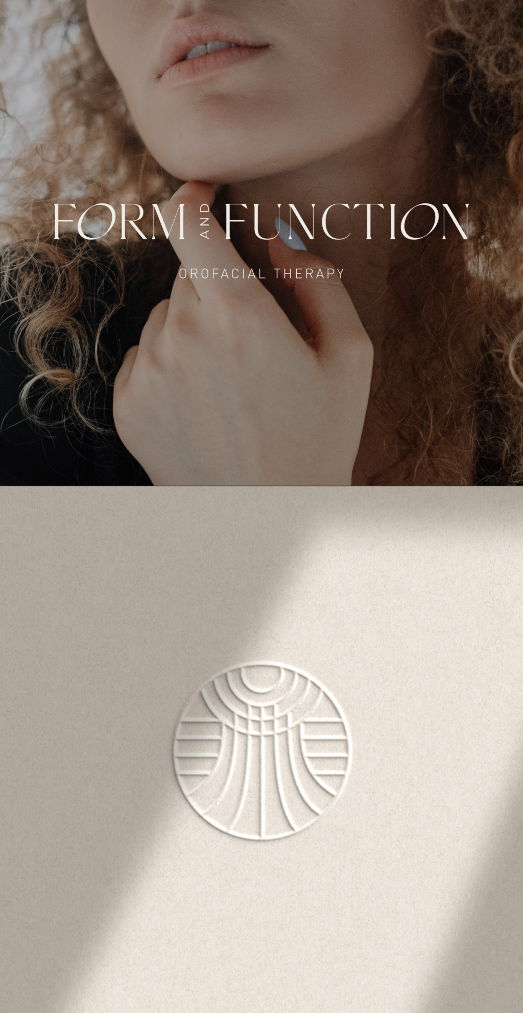
This project really got me out of my comfort zone to create a more holistic branding design for a very specific online service. I actually didn’t know that this form of physical therapy existed. It is all about myofunctional or orofacial therapy and it is a very niched type of therapy which my client wanted to emphasize in her branding.
I had to do a ton of research to really get the science behind orofacial therapy and how it specifically targets the jawline and some orthodontic problems. With this in mind, I got to work to try and create a holistic brand that would really encapsulate the primary service my client offered.
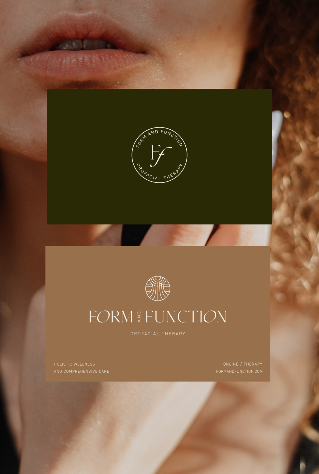
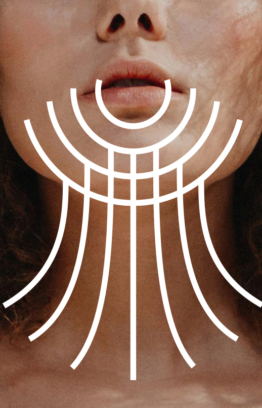
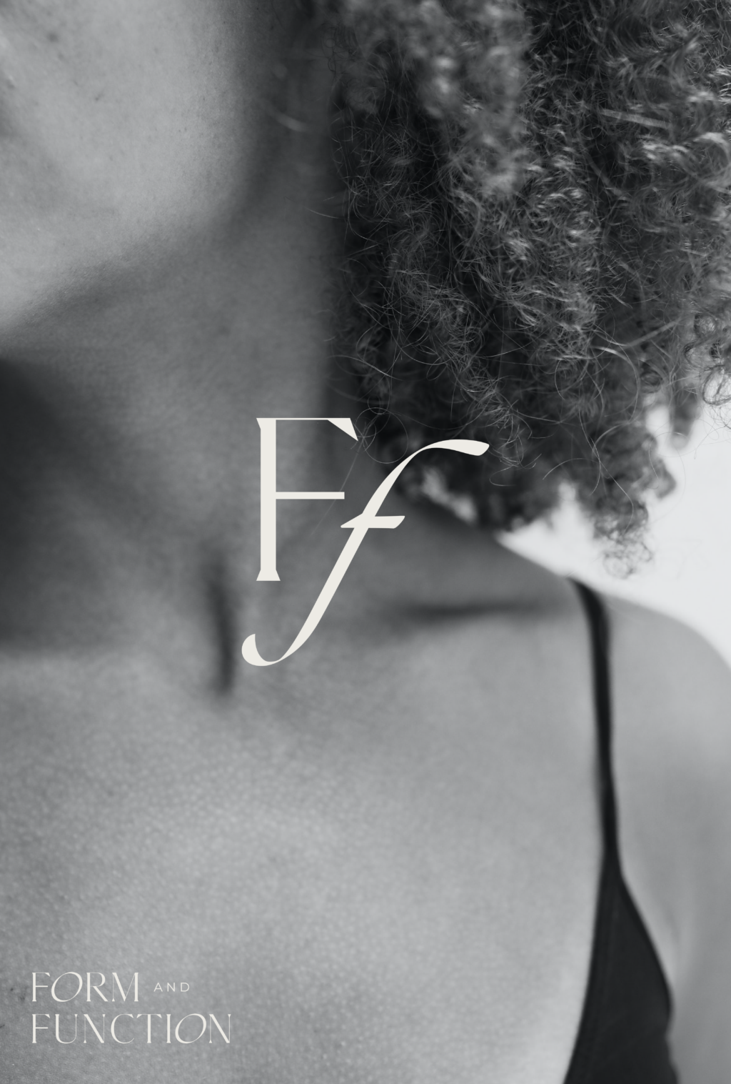
I had the idea to create a gender neutral icon that served to better represent the “orofacial” focus of the business and the target audience. So I designed a very specific icon that showcased the neck and jawline in a very minimal and high-end design.
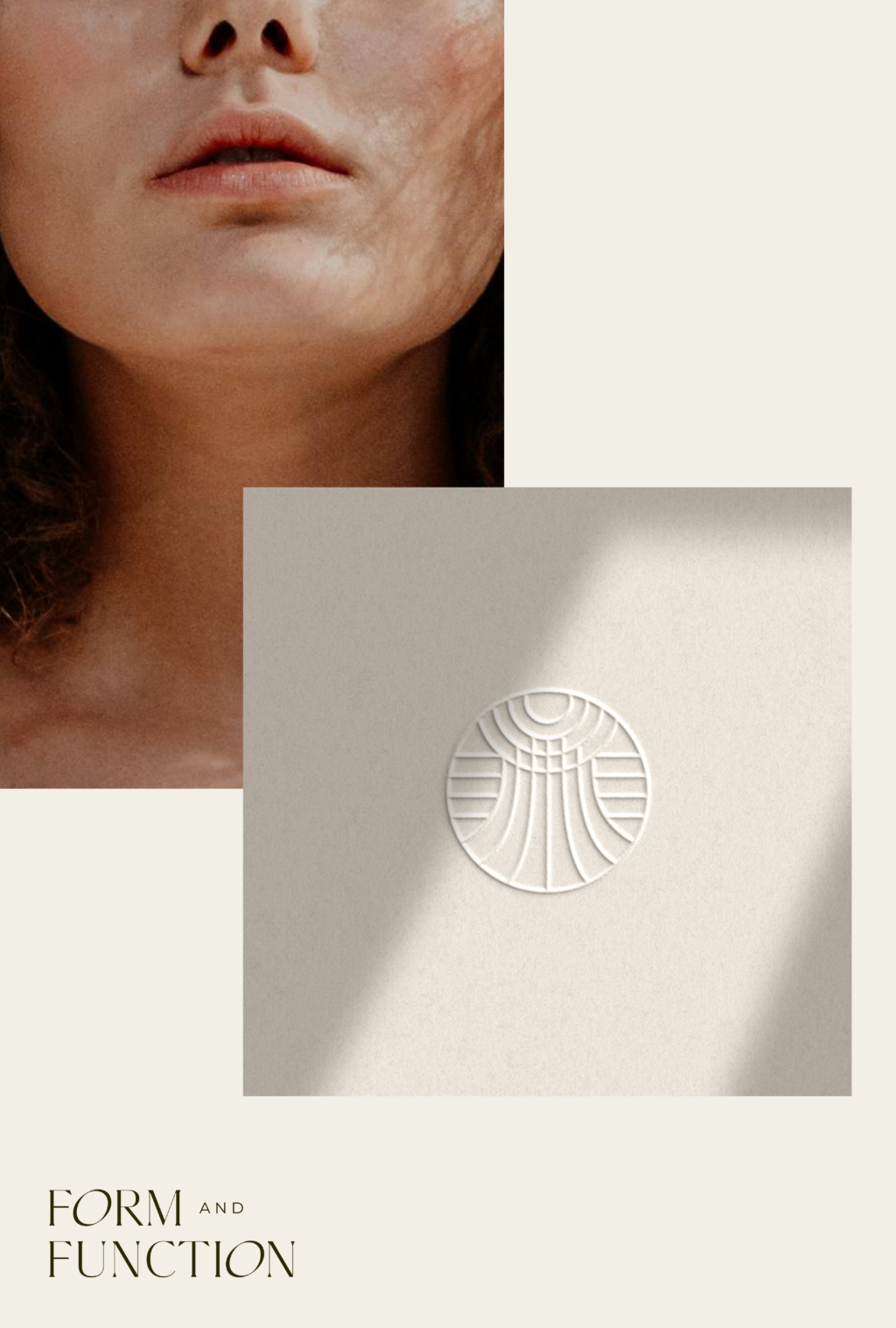
The icon itself is an abstract shape that takes the parts of the body to be healed by the main service in online courses: the face and jaw muscles. If you take a look at the image, you can see where the icon takes shape. It is also a dynamic icon with movement.
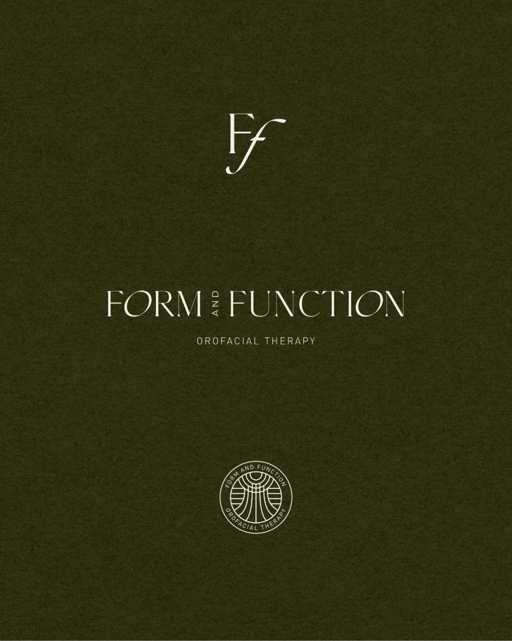
I wanted it to be subtle but also easy to spot. The icon itself is contained inside a circle and can be used as a badge or as a stand alone. It works really well as an accent for the overall holistic branding. It is meant to be minimal in nature and to be used as an accent like in gold foil for a pop on any business asset.
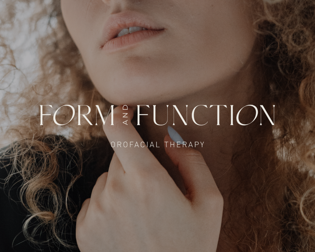
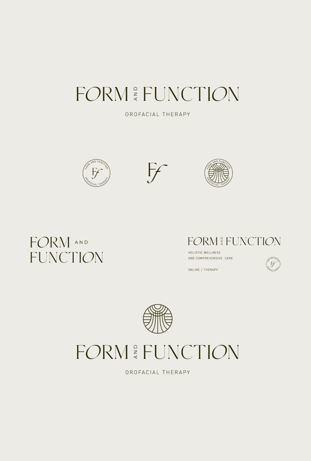
The overall brand for Form and Function has a high-end and gender neutral vibe. It’s timeless without being too serious. It has a conceptual edge that blends the professional space with a luxurious vibe.
If you’re in need of a rebrand too, I’d love to chat! Check out my Services page or reach out out and inquire about your project.