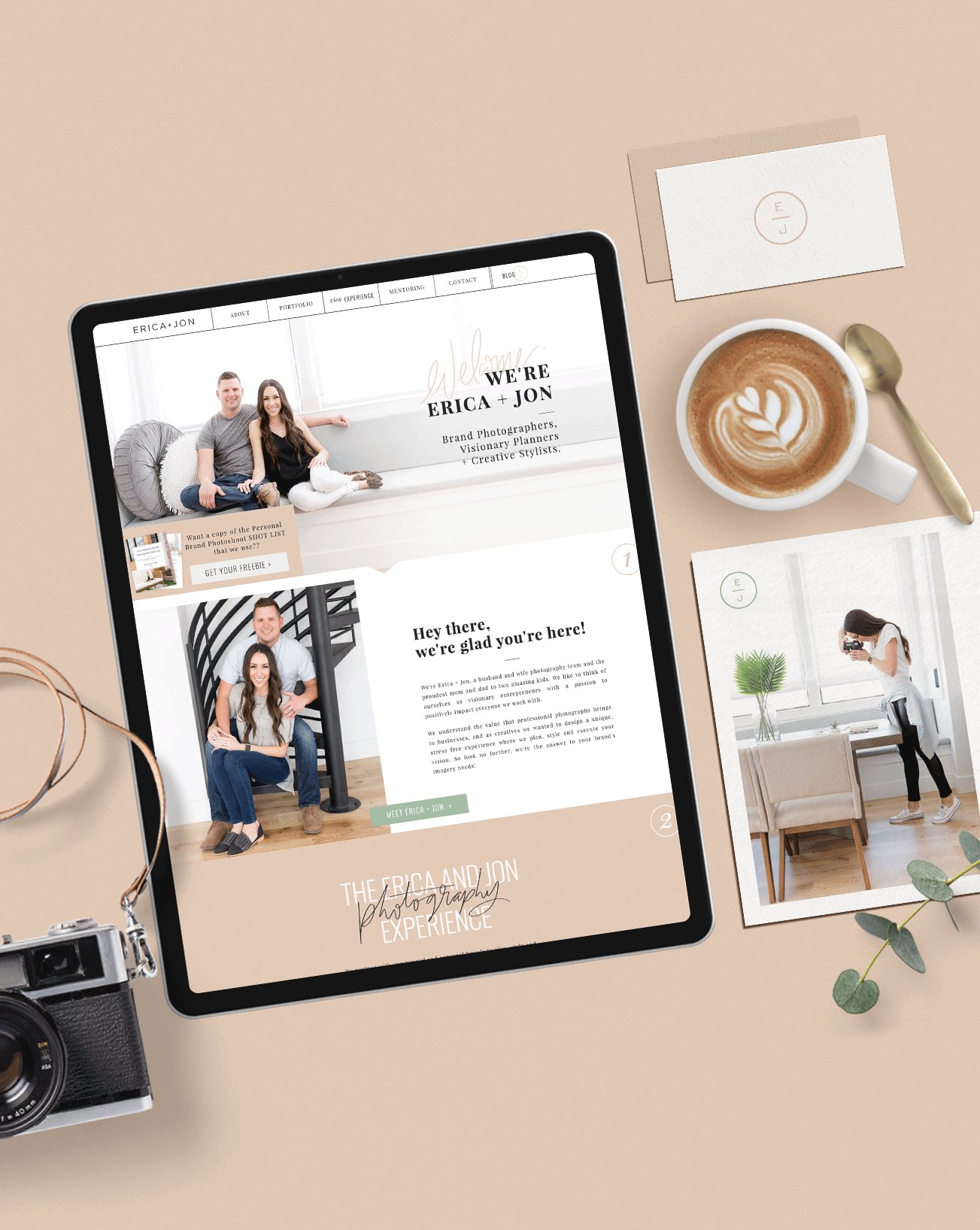
It feels like a million years since I’ve done a design spotlight post. Balancing clients and big projects is no joke and I know I’m not alone when I say that sometimes updating your portfolio takes the backseat. A year later, I am happy to be posting this amazing branding I created for Erica + Jon!
They came to me when they started to shift their photography business into branding. They saw a gap in their market and decided to go for it. Their energy and passion is contagious and I think it’s safe to say we all clicked when we started working together! They like to joke about being the Chip and Jo of photography but they are not wrong! If you have had the pleasure of meeting them, then you know that’s right on the money. They have this unique blend of talents and balance each other out perfectly. Their personalities were a huge driving force to creating their branding.
Photography Branding
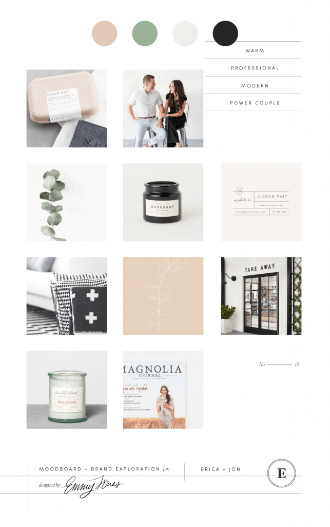
To set the tone I created a earth tone based mood board by pulling inspiration from Magnolia by Joanna Gaines. I really wanted to incorporate clean lines and structure into their brand to create a high-end look and balancing it out with some organic shapes and colors.
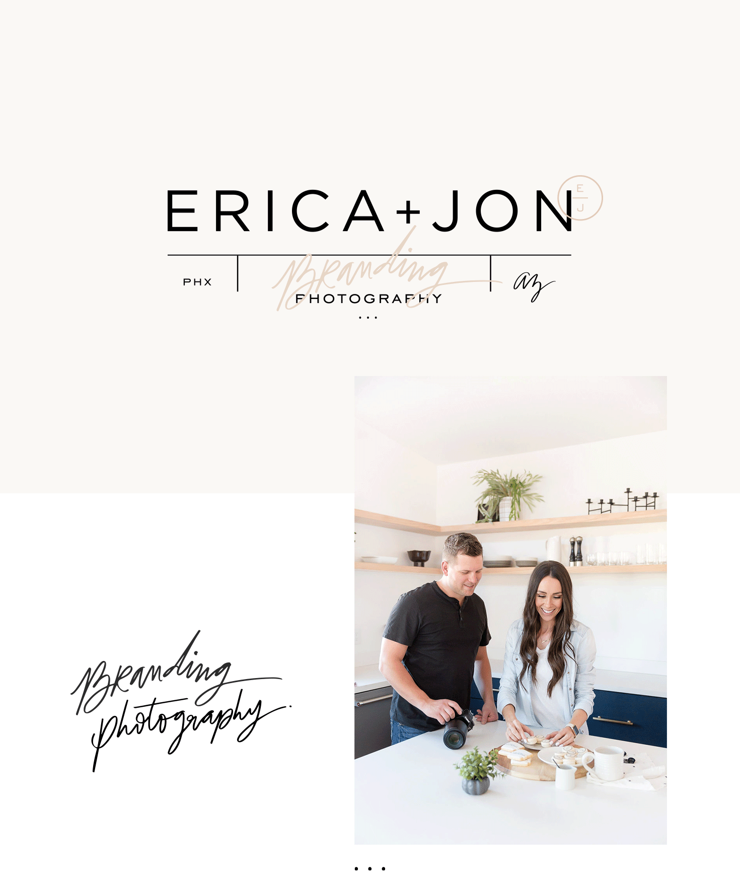
The base of their branding is a modern san-serif font that creates a strong logotype. To add personality I added some hand lettered elements and balanced them out with geometric shapes and lines that allow flexibility and variations to the overall branding system. The hand lettered elements add a touch of their fun personalities and gives the brand an overall friendly approach.
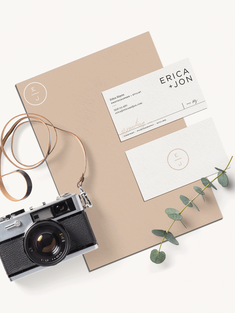
I love working with clients that similar values as myself and my business. The fact that we are both in the branding business made this partnership have an extra layer of depth. We understood each other in the creative process which meant that this whole project just felt like one big collaborating party. With their gorgeous brand photography and my graphics, we were able to dive deep into the next phase: their website.

Website Design + Copywriting
Their new website (which you can visit here) was built on Showit. I was very new to that platform, having only worked on WordPress sites before, but they trusted me fully and knew there would be a learning curve for me. I honestly got hooked almost instantly on Showit and how similar it is to Adobe Illustrator. I am so grateful to them for allowing me the time to learn this new platform and be able to design and create their new website.
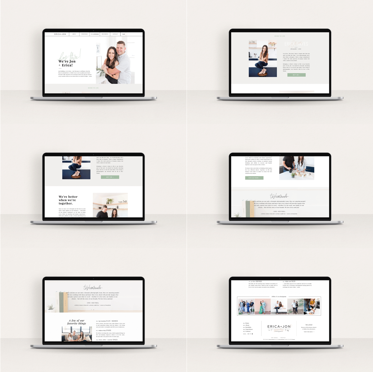
So what do you think? Are you as obsessed with their branding as I am? Let me know in the comments!
