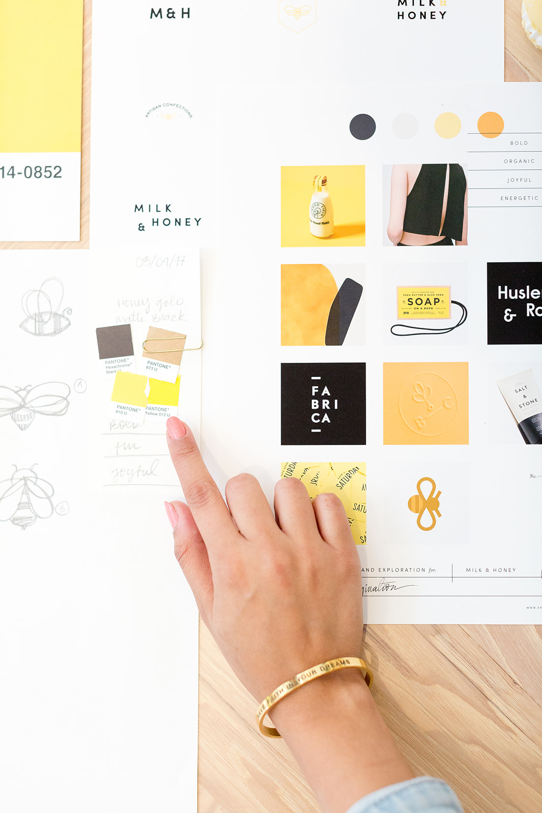
Branding is my jam! But I totally get that some entrepreneurs are not trained designers, and that’s totally ok! Being your own boss means wearing a lot of hats, some of them waaay out of your comfort zone (like accounting, amiright?!).
A lot of you have been asking me for branding tips over on my Instagram and I thought I would finally round up all of my top tips to create a more cohesive brand — without having to know any design programs. These are simple things that you can start implementing to level-up your brand. You don’t need to get fancy, you just need to know the basics and I promise that it is not as hard. So even if you know nothing of design, I want you to feel confident that you can implement some of these tips to start upgrading your brand.
Tips for a Cohesive Brand
I want to start by sharing a little bit on the importance of WHY you need a cohesive brand. It’s more than just aesthetics. It’s to get people to trust you. To establish a strong presence and position yourself inside your market. A cohesive brand will make your dream tribe instantly recognize you no matter where they see your business. It really is more than looks, it’s the whole experience! How they see you, how they interact with you, what they say about you when you are not in the room. Your brand is an entire experience, so it’s important that everything is flowing together and expressing the same messaging. So really evaluate your branding as you read my tips so you can get the most out of this post.
If you ever need any extra help, I have a whole guide to level-up your branding. So feel free to download it. In fact, it walks you through actionable steps so you can start shaping your brand into cohesive awesomeness.
1. Think Minimally
Minimalism is your friend and less really is more. A cohesive brand is a delicate balance of graphics that play off one another. I know sometimes people think that the more in your face a brand is, the higher the chance to get in front of your dream customer/client. It’s actually quite the opposite. Nowadays, clean branding is more important because it really represents your brand’s core message without any gimmicks. So for my first tip, really look at your branding and establish what is really working in your favor and what is fluff. This can be anywhere between using more than 4 colors to using over the top fonts or graphics that just don’t make sense.
2. Stick to 2-3 Fonts That Complement Each Other
Make sure that you are using the same fonts everywhere. Also make sure that those fonts are easy to read and balance each other out. You want to establish a hierarchy of fonts where one is always going to be calling the attention and the other is just there to support the idea. I know it can get crazy with fonts, but try to stick to ones people can read, that hand lettered trend will leave us one day!
3. Make Your Life Easier + Invest in Aesthetics
I think that one of the main problems that people face (myself included) is to have a cohesive aesthetic when it comes to photography. It is necessary, you need photos for everything... social media, your website, marketing materials… the list is endless! If you’re not a photographer, know that it’s totally ok! There are other ways to get a cohesive aesthetic. We live in a world where the internet is a wonderful place that holds all the answers to our biggest problems! Check out one of the thousands of stock sites and choose some photos that match your brand. There are subscription services that are as little as $20 a month. My favorites are Haute Stock and Social Squares. If all else fails, purchase a Lightroom preset to use on all your photos. It will give it the same aesthetic. I truly believe this is one of those areas where you should make your life easier and just invest.
4. Have a Voice
Have the same messaging (with the same tone) across the board! You want to make sure that the language you are using — a few key phrases, are consistent. Plus, you probably have an amazing story that is part of your brand already so use it to your advantage. Part of a cohesive brand is being able to relay the same messaging and values no matter what you are advertising or talking about at the moment. For example, I always use the same type of phrases like dreamers, magic, self love, mindset. It’s part of my brand! You will never catch me using phrases like, botox for example… but that is a bit extreme ????
5. Create a Brand Guide
Finally, create a brand guide! You need to have something handy so that everyone that comes into contact or handles your brand knows how to use your assets. A brand style guide communicates your design ~aesthetic~ to all of your peers. That can include clients, followers, contributors, everyone who comes in contact with your brand. Having a document to reference your design standards will make your life easier. Let’s say that you are going to hire a freelance writer to help you with your blog. How do you onboard them to your business? That’s where it comes in handy and it makes sure that your brand looks cohesive across the board!
Did you find certain things you need to upgrade on your own brand? Remember, if you still need a bit of help, you can get my free branding evaluation workbook and take action right now to level-up your biz.
How do you keep your brand consistent? Are there any areas you have issues with? Let me know in the comments! I’d love to help!
